Project Overview
This project focused on building a complete UX and UI design system for an interactive museum experience. I worked through the full design process, including initial sketches, wireframes, sitemap development, visual identity, wayfinding elements, and the creation of both a website and a mobile app. Using tools like Figma, Illustrator, Photoshop, and Canva, I designed a cohesive multi-platform experience that demonstrates my ability to plan structure, prototype user flows, and deliver polished final interfaces.
Tools Used
I used Figma to create the full digital workflow for the project, including wireframes, high-fidelity screens, and interactive prototypes for both the website and the app. It was the main tool for shaping layout, structure, and user flow.
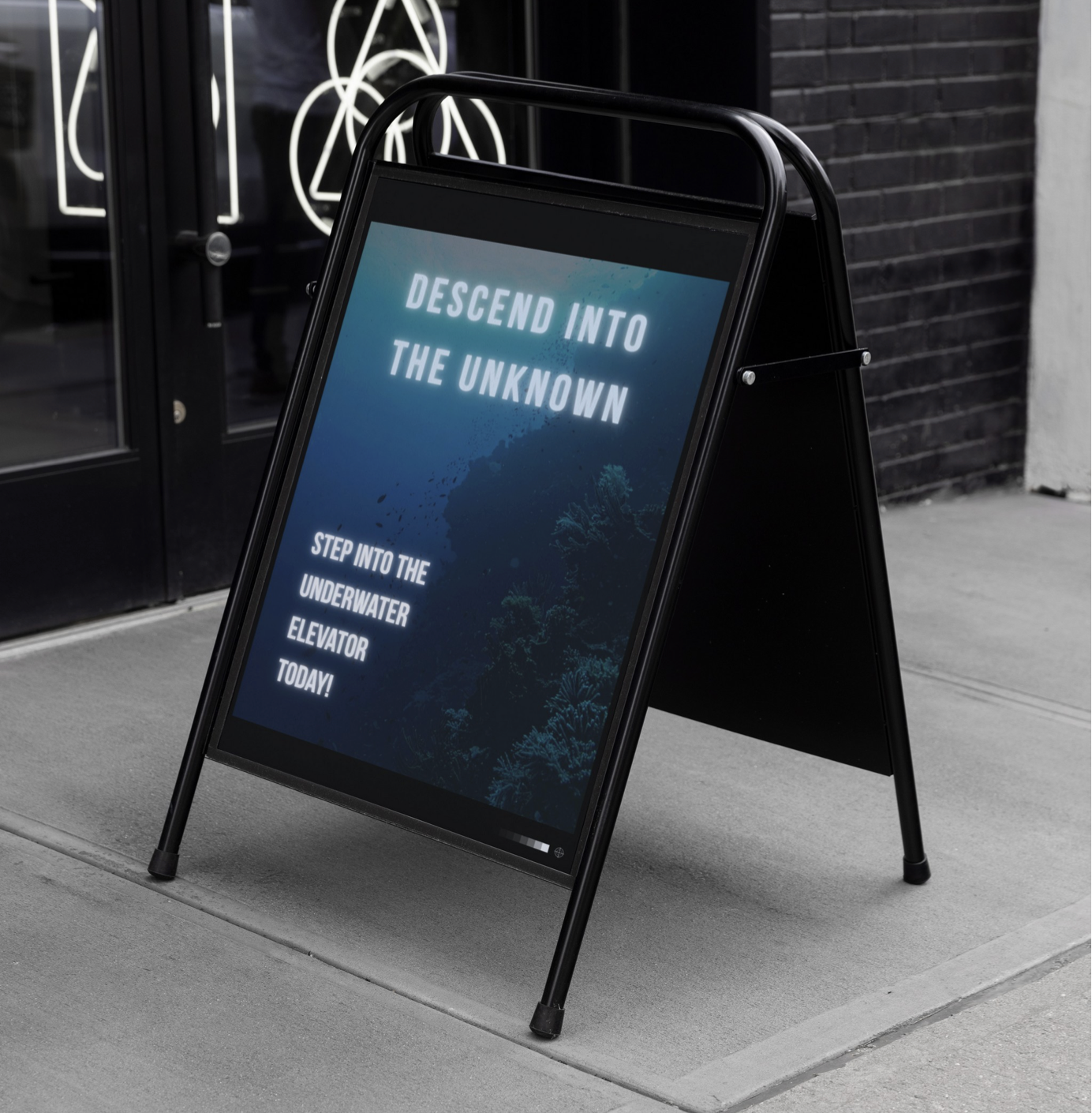
Photoshop was essential for designing wayfinding elements for the physical exhibit, such as signage and posters. I also used it to refine images by adjusting lighting, color, and overall composition.
I used Firefly to generate underwater AI images that became part of the visual tone for the exhibit. These images were refined later in Photoshop and helped support the overall look and feel of the project.
Canva helped me customize my hero images with text and layout experiments. I used it to quickly explore presentation ideas and create visuals that supported the larger narrative of the exhibit.

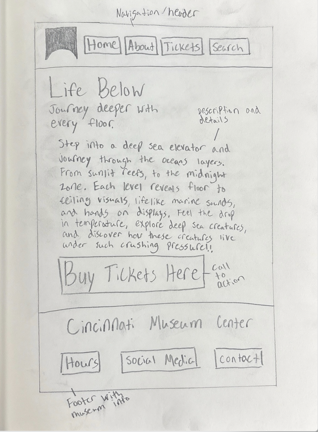
Website Sketches
These early sketches explore the structure of the website, where I experimented with layouts, navigation, and how to introduce the core ideas of the project before moving into digital wireframes.
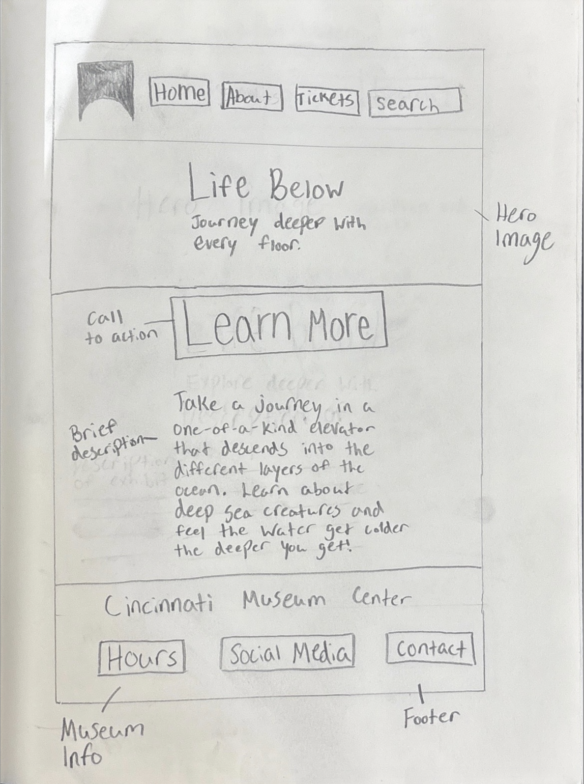
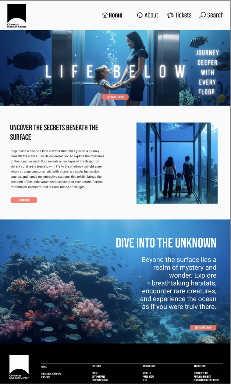
A rough outline of the homepage where I explored the main navigation, hero image placement, and introduced the idea of the underwater elevator experience.
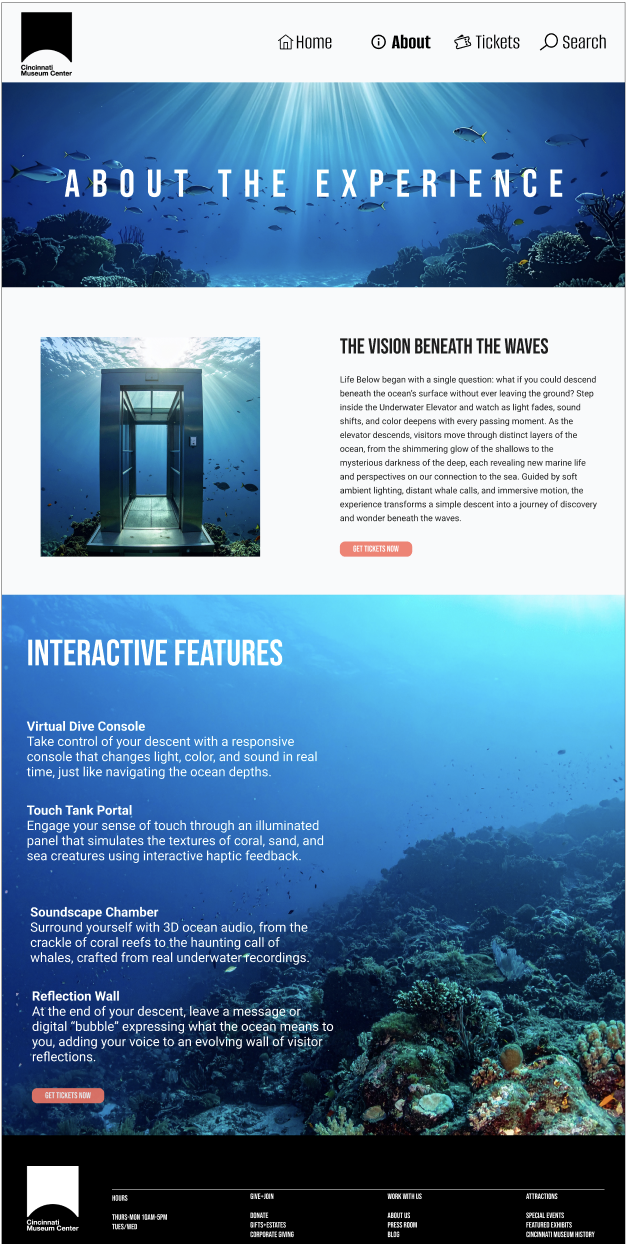
An early idea for the About page, testing how much text to include and where to place supporting details about the exhibit.
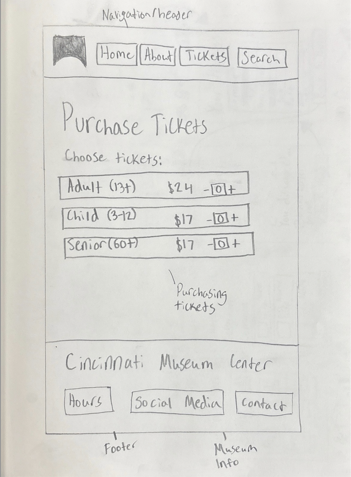
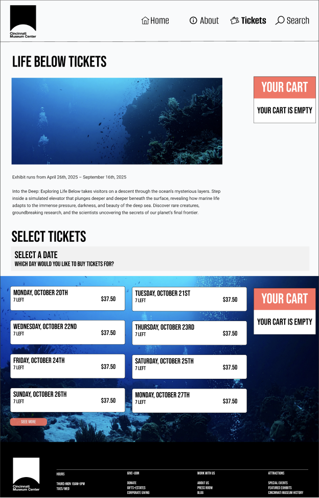
This sketch focuses on the ticket-buying experience and how to lay out pricing, CTAs, and museum details in a clear way.
Website Wireframes
After sketching, I moved into Figma to create low-fidelity wireframes. These helped me refine spacing, hierarchy, and interaction patterns before adding visuals or branding.
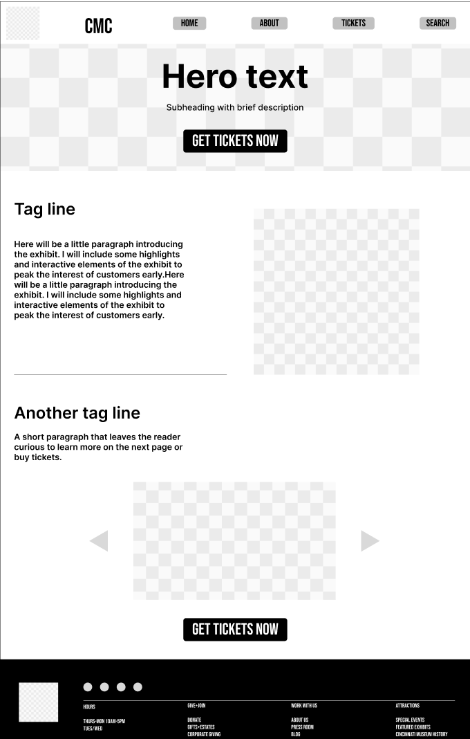

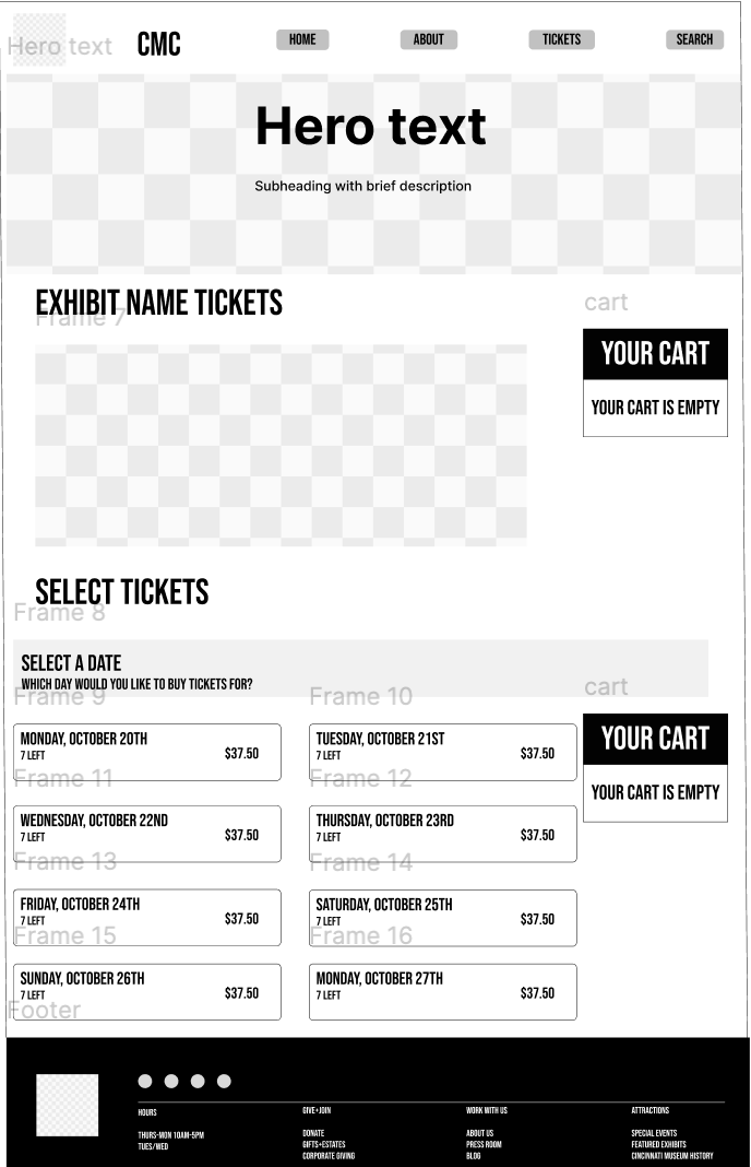
Website High-Fidelity Screens
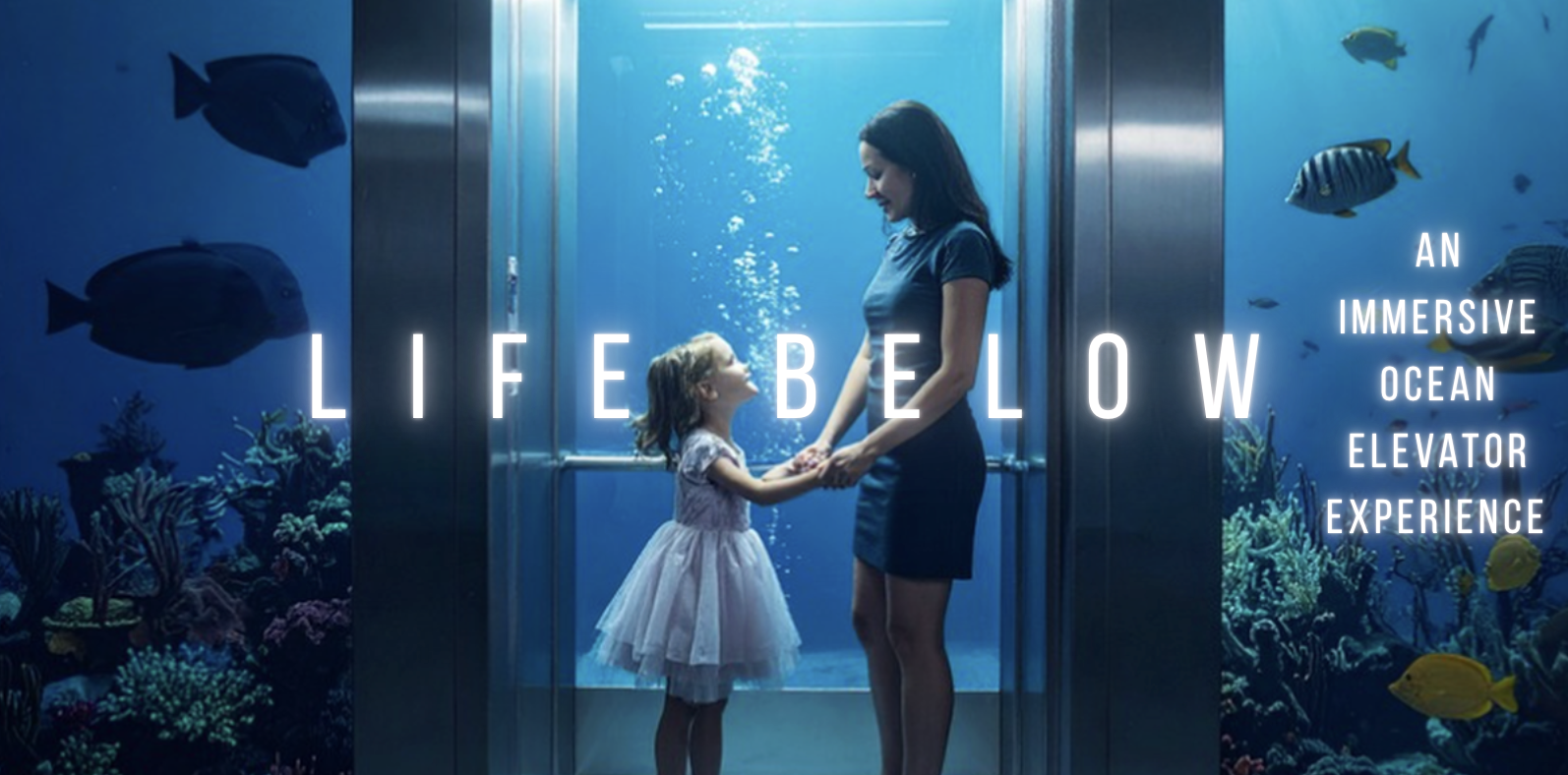
Once the structure was set, I designed the final website screens. I focused on clarity, atmosphere, and consistent visual direction that matched the “Life Below” theme.
Website Navigation Preview
App Sketches & User Flow
This sketch maps out how a user would move through the app, helping me plan the full interaction flow before designing the screens digitally.
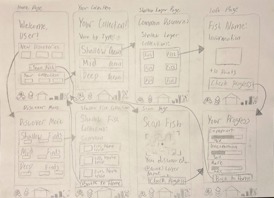
A hand-drawn flow showing how users move through the app: home screen → collections → fish details → progress. This helped me understand what screens were needed before creating digital wireframes.
App Wireframes
I created low-fidelity wireframes in Figma to define the structure of each screen and test different navigation ideas.
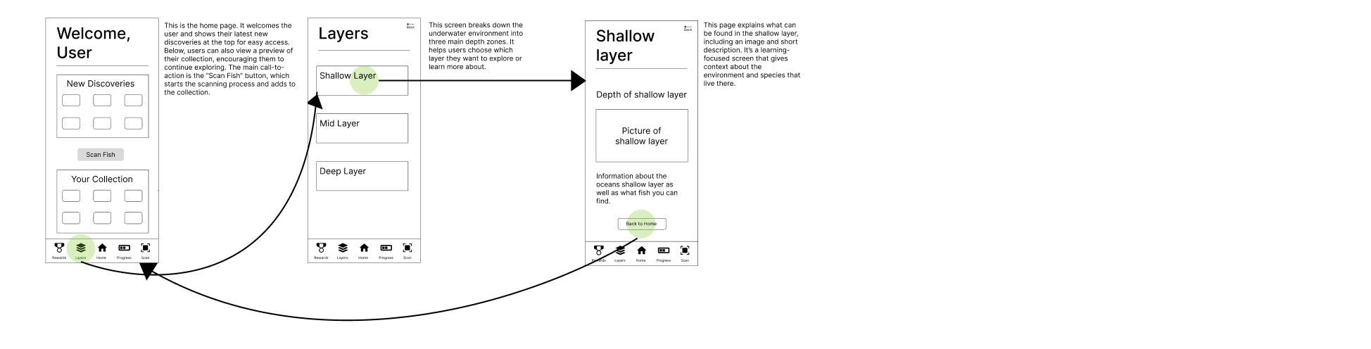
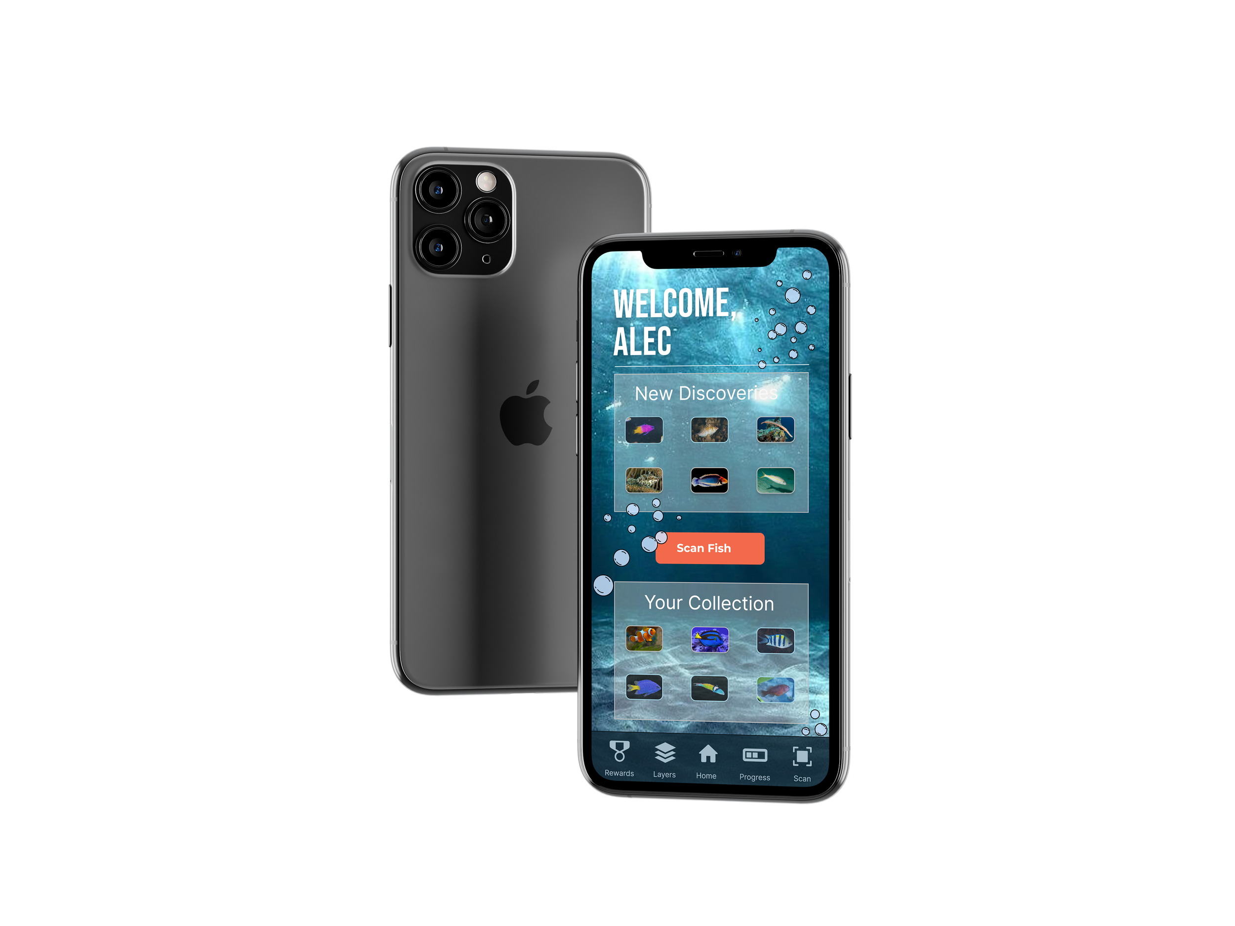
Final App Design
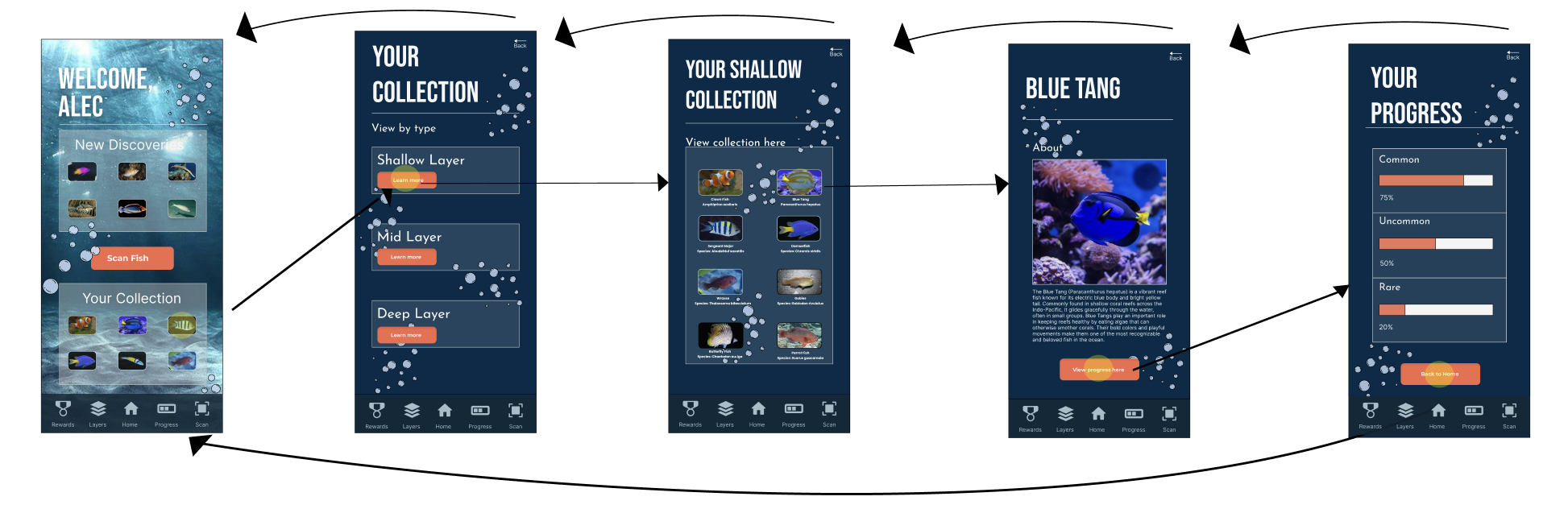
The final app screens focus on clarity, movement, and visual consistency with the website and exhibit.
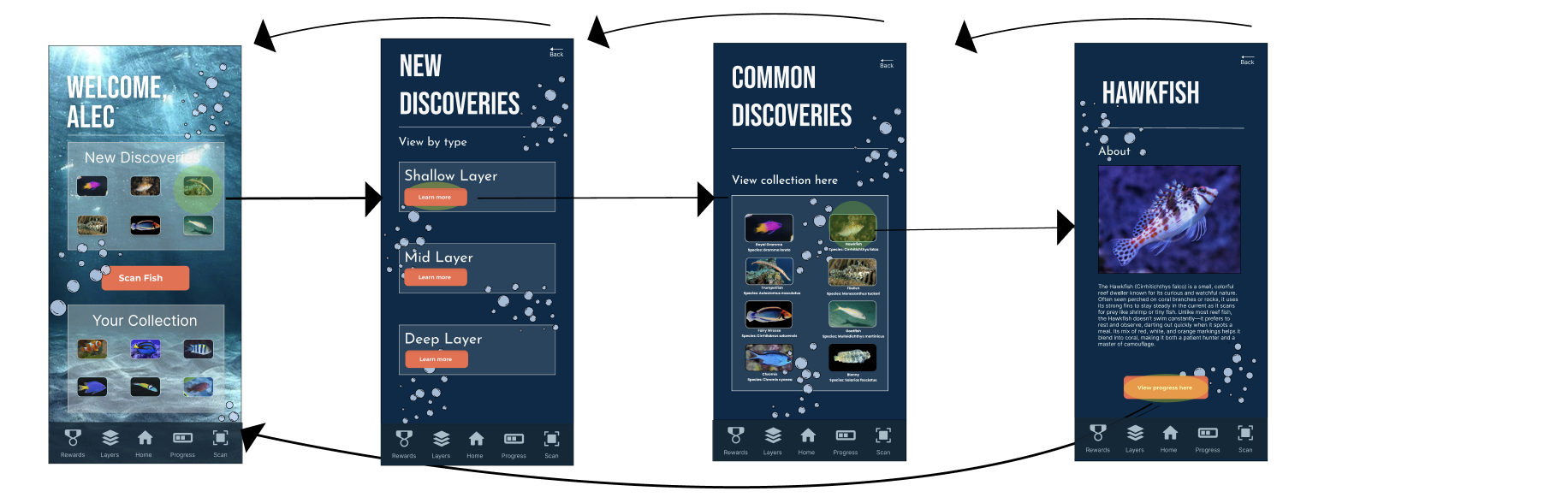
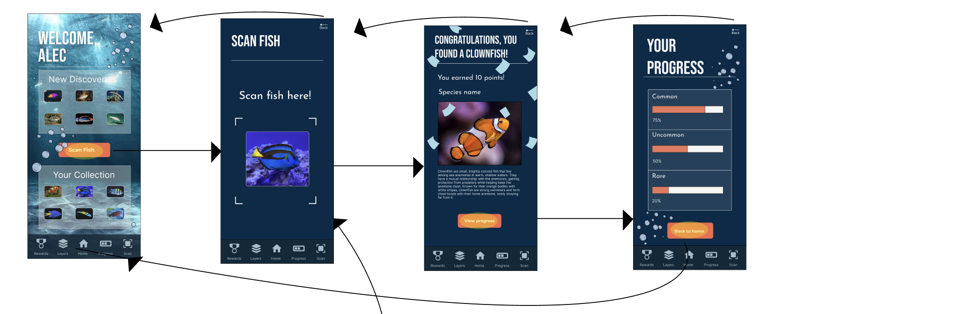
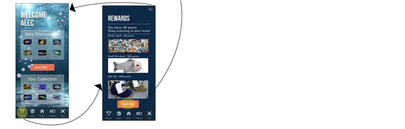
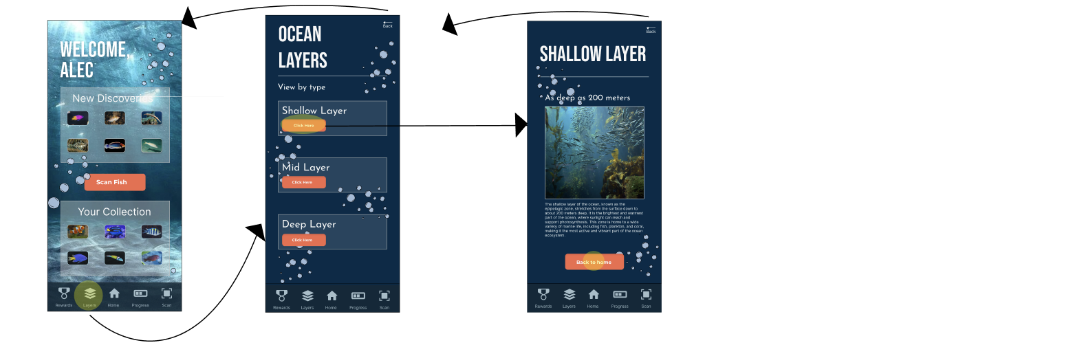
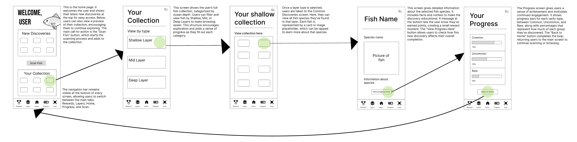
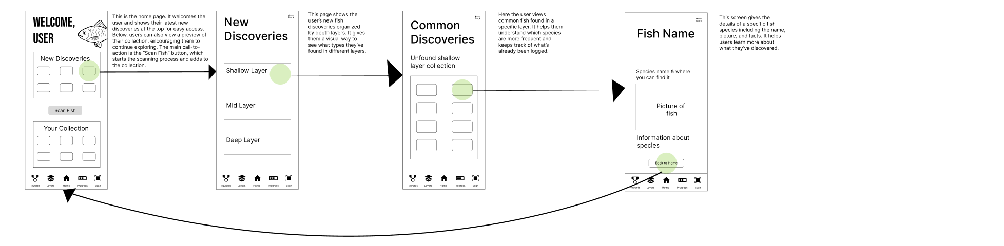
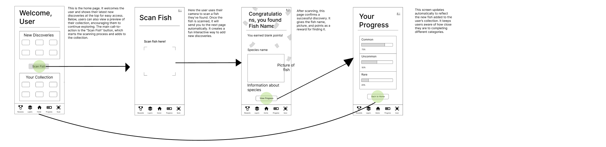
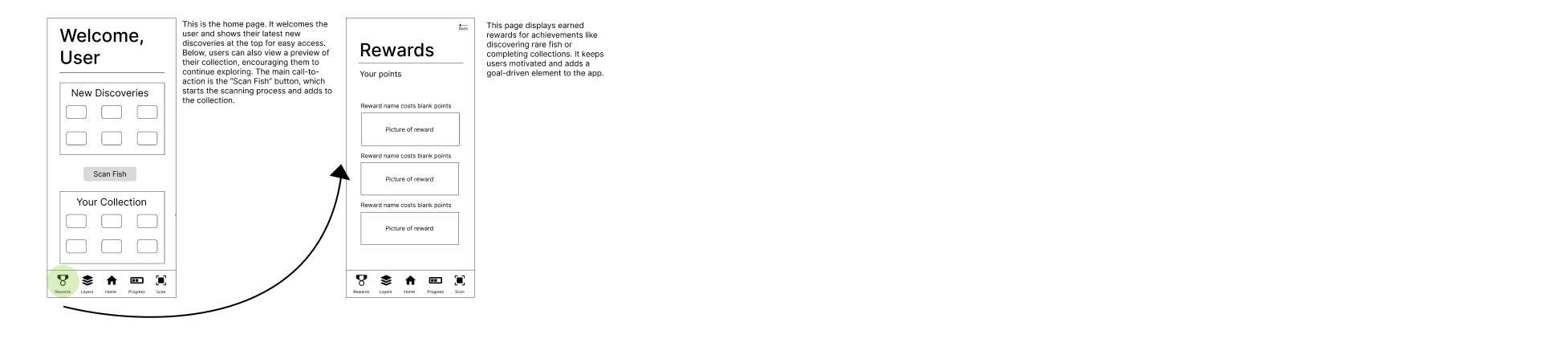
App Interaction Overview
The app was designed to guide users through the exhibit by letting them scan fish, collect species, and track their progress through each ocean layer. This section shows how the main interactions function in the final design.
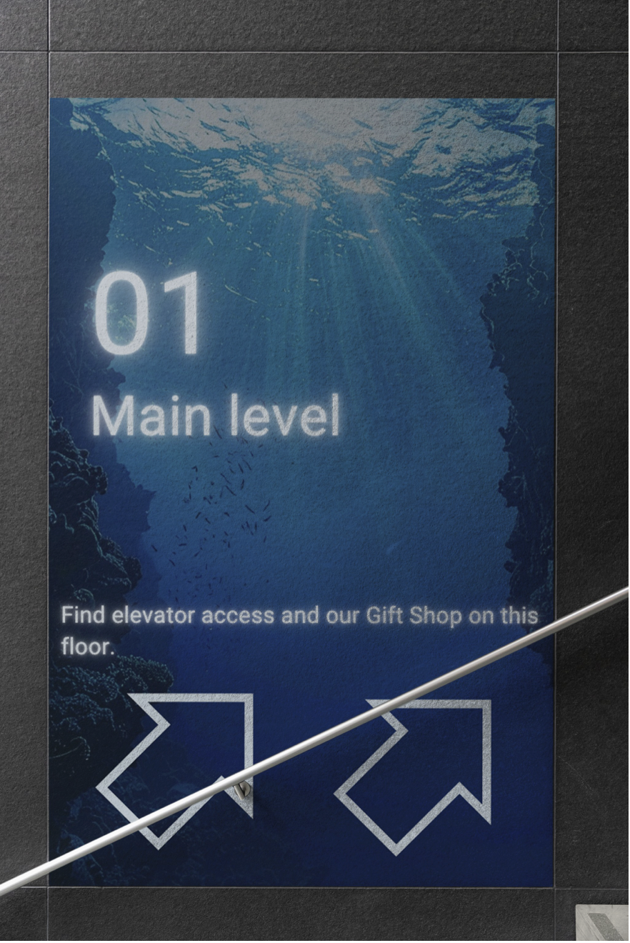
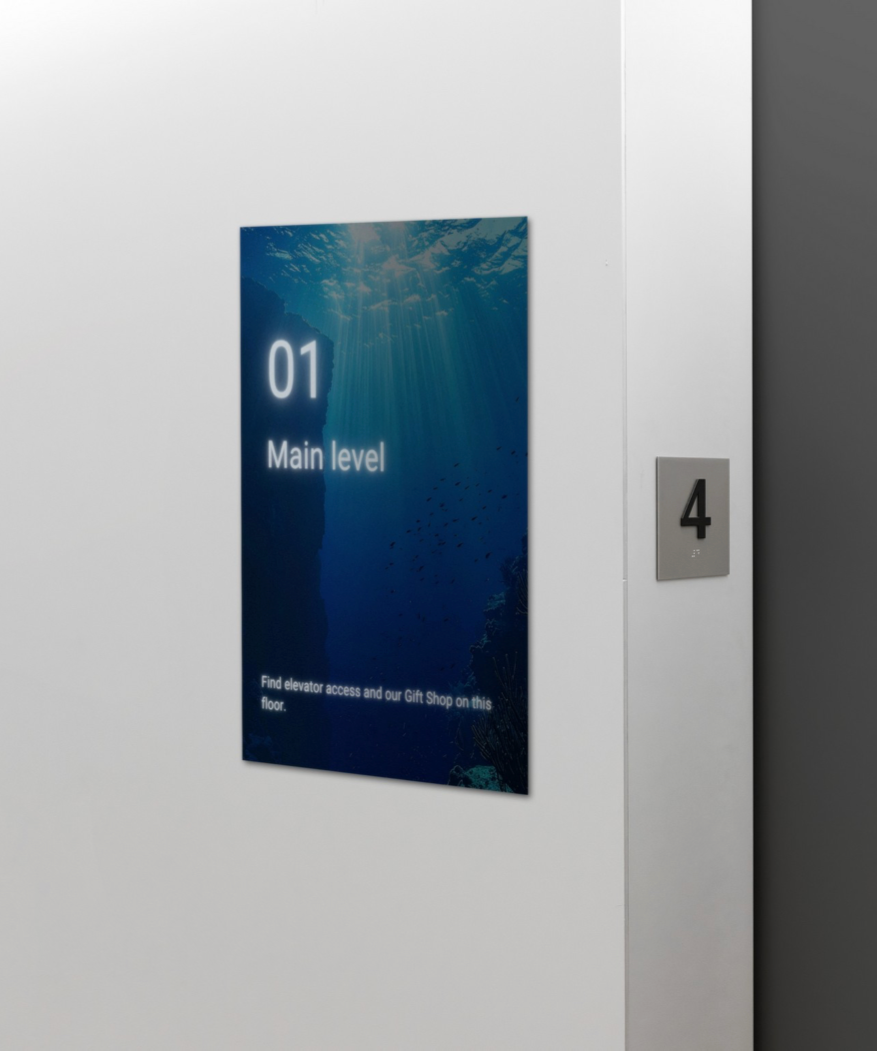
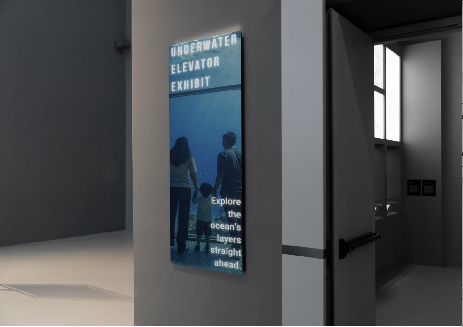
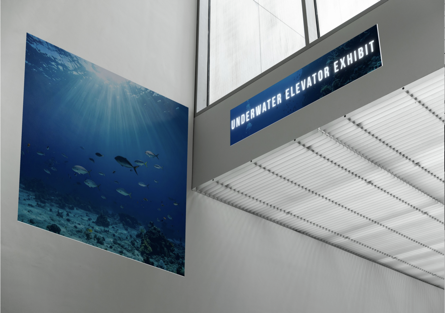
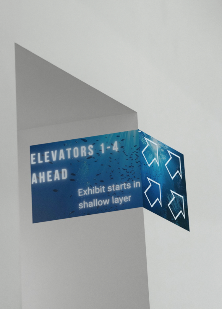
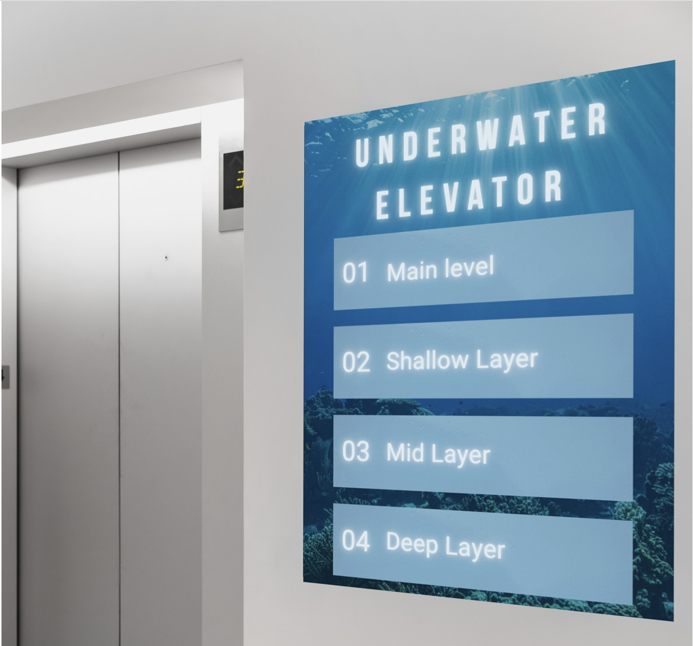
Wayfinding Elements
These wayfinding elements guide visitors through the exhibit, helping them understand what experiences and information are available at every level.
Visual System
This visual system defines the core look and feel of the Life Below exhibit, including the color palette and typography that guide both the digital and physical experience.
Color Palette
These colors reflect the exhibit’s style, moving from shallow ocean hues to deeper, darker layers. They form the foundation for the website, app, and wayfinding materials.
Primary Colors
#002A47
#017ECB
#1E6F80
Accent Colors
#A6E7F2
#F26A4B
Neutral Colors
#FFFFFF
#A0B7CA
Typography
The type system pairs a bold font with a clean, readable body font to maintain a clear visual hierarchy across both the website and the exhibit materials. This mix helps guide attention, supports wayfinding, and keeps longer text easy to scan.

Used for titles, section headers, and signage. Its tall, condensed shape makes important information stand out without feeling heavy.

Used for paragraphs, captions, and smaller UI text. Roboto’s open shapes and balanced spacing make it comfortable to read on both digital screens and printed signs.